EZOFF | Built for Performance

PROP FIRM PAL

PROP FIRM PAL

A brand identity created for a precision automotive tool built to make Porsche centerlock wheel removal easier, safer, and more effortless.

A modern brand and digital platform designed to make prop firm comparison clearer.

A modern brand and digital platform designed to make prop firm comparison clearer.

Client

Jake | Founder of EZOFF

Role

Brand Design

Date

2026

Propfirmpal-brand-design-thumbnail

ABOUT EZOFF

THE STARTING POINT

THE STARTING POINT

propfirmpal-about
propfirmpal-about

THE CHALLENGE

THE DIRECTION

THE DIRECTION

A SERIOUS TOOL NEEDED A BRAND TO MATCH.

EZOFF had the hardware, what it needed was a brand that looked like it belonged behind it.

The visual direction focused on creating a modern identity that could turn complex financial information into something approachable and easy to navigate. The brand needed to feel professional while remaining within the trading and fintech space.

A modern identity designed to make complex financial information feel approachable and professional within the trading space.

problem
solution
problem
problem
solution
solution
00123456789
Concept Exploration
Starting with a friendly, character driven direction, this concept aimed to make PropFirmPal feel approachable. However, it leaned too heavily toward a mascot style and felt less suited to a professional financial platform.
00123456789
Symbolic Direction
Simplifying the idea into a “P” created a cleaner, more professional foundation. However, it felt too generic and lacked a distinctive visual characteristic.
00123456789
Final Mark
The final mark distills the concept into a fluid, recognizable “P” built from interlocking forms. Its upward movement suggests progress and guidance, while the simple silhouette ensures strong recognition across the PropFirmPal brand.

LOGO DESIGN

LOGO DESIGN

A MARK WITH MECHANICAL WEIGHT.

The mark needed to feel as solid as the tool itself.

I explored compact forms and mechanical geometry to create a logo with enough weight to stand out on the product while remaining clear at smaller sizes.

The mark went through stages of exploration, refining the silhouette, proportions and overall balance until the final form felt both recognizable and ownable.

The mark evolved through refinement of its silhouette, proportions, and balance until the final form felt recognizable.

00123456789
Concept Exploration
Starting with a friendly, character driven direction, this concept aimed to make PropFirmPal feel approachable. However, it leaned too heavily toward a mascot style and felt less suited to a professional financial platform.
00123456789
Symbolic Direction
Simplifying the idea into a “P” created a cleaner, more professional foundation. However, it felt too generic and lacked a distinctive visual characteristic.
00123456789
Final Mark
The final mark distills the concept into a fluid, recognizable “P” built from interlocking forms. Its upward movement suggests progress and guidance, while the simple silhouette ensures strong recognition across the PropFirmPal brand.
ezoff-logo-design-sketch-exploration.jpg

VISUAL IDENTITY & MOCKUPS

VISUAL IDENTITY & MOCKUPS

TURNING ENGINEERING INTO A VISUAL SYSTEM.

The logo became the foundation for a visual system built across typography, color, and supporting graphic elements.

A visual system designed for clarity, confidence, and recognition.

A visual system designed for clarity, confidence, and recognition.

propfirmpal-logo-sketch
propfirmpal-logo-1
propfirmpal-logo-1
propfirmpal-color-scheme
propfirmpal-logo-2
propfirmpal-logo-2
propfirmpal-brand-guidelines
propfirmpal-mockups
propfirmpal-mockups
propfirmpal-brand-guidelines
propfirmpal-mockups
propfirmpal-mockups
propfirmpal-brand-guidelines
propfirmpal-mockups
propfirmpal-mockups
propfirmpal-brand-guidelines
propfirmpal-logo-stack
propfirmpal-color-pallete-complex
propfirmpal-mockups
propfirmpal-mockups
propfirmpal-logo-1
propfirmpal-logo-1
propfirmpal-logo-2
propfirmpal-logo-2
propfirmpal-color-scheme
propfirmpal-brand-guidelines
propfirmpal-logo-stack
ezoff-brapropfirmpal-brand-guidelinesnd-identity-system.png
propfirmpal-brand-guidelines
propfirmpal-mockups
propfirmpal-mockups
propfirmpal-mockups
propfirmpal-mockups
propfirmpal-brand-guidelines
propfirmpal-color-pallete-complex
propfirmpal-mockups
propfirmpal-mockups
propfirmpal-mockups
propfirmpal-mockups

FROM IDENTITY TO PRODUCT

THE PRODUCT & UI/UX DIRECTION

THE PRODUCT & UI/UX DIRECTION

A brand identity proves itself when it leaves the screen.

Applied to the EZOFF tool, the identity becomes a physical expression of the precision and performance behind the product.

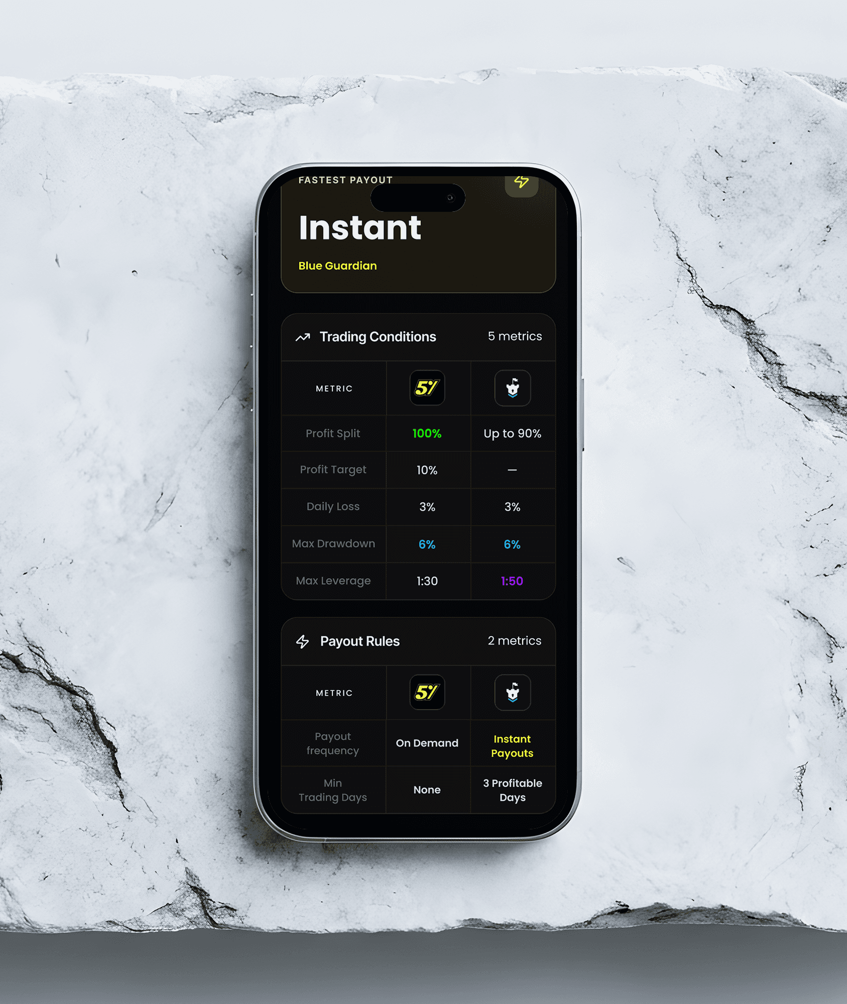
PropFirmPal's identity was translated into a structured interface designed to make comparing prop firms faster, clearer, and easier to understand.

PropFirmPal's identity was translated into a structured interface designed to make comparing prop firms faster and easier to understand.

propfirmpal-landing-page
propfirmpal-design-process
propfirmpal-userflow
propfirmpal-comparison-ui
propfirmpal-firm-ui
propfirmpal-firm-ui
propfirmpal-firm-offers-ui
propfirmpal-firm-updates-ui
propfirmpal-firm-rules-ui
propfirmpal-traders-sentiment-ui
propfirmpal-landing-page
propfirmpal-design-process
propfirmpal-userflow
propfirmpal-comparison-ui
propfirmpal-firm-ui
propfirmpal-firm-ui
propfirmpal-firm-offers-ui
propfirmpal-firm-updates-ui
propfirmpal-firm-rules-ui
propfirmpal-traders-sentiment-ui

THE RESULT

RESPONSIVE EXPERIENCE

RESPONSIVE EXPERIENCE

A BRAND BUILT TO MATCH THE PRODUCT.

The result is a sharper, more confident identity built around precision, performance, and a premium automotive character.

A consistent product experience across every screen size.

A consistent product experience across every screen size.

propfirmpal-responsive-experience-ui

THE RESULT

A clearer brand and a smarter way to compare prop firms.

propfirmpal-about-2
propfirmpal-about-2
propfirmpal-thanks-for-watching
chris-ross-client-review-propfirmpal

THE RESULT

A clearer brand and a smarter way to compare prop firms.

propfirmpal-about-2
propfirmpal-about-2
propfirmpal-thanks-for-watching
chris-ross-client-review-propfirmpal

Selected Work

THE STARTING POINT

propfirmpal-about

THE DIRECTION

The visual direction focused on creating a modern identity that could turn complex financial information into something approachable and easy to navigate. The brand needed to feel professional without becoming overly corporate, while remaining distinctive within the trading and fintech space.

problem
solution

LOGO DESIGN

The mark went through multiple stages of exploration, refining the silhouette, proportions, expression, and overall balance until the final form felt both recognizable and ownable.

00123456789
Concept Exploration
Starting with a friendly, character driven direction to make PropFirmPal feel approachable and accessible. The concept introduced a more playful personality, but it leaned too heavily toward a mascot style identity and felt less suited to a professional financial platform.
00123456789
Symbolic Direction
Reducing the idea into a simplified “P” form introduced a cleaner and more professional foundation. However, the structure felt too generic and lacked a distinctive visual characteristic that could make PropFirmPal immediately recognizable.
00123456789
Final Mark
The final mark distills the concept into a fluid, recognizable “P” built from interlocking forms. Its upward movement suggests progress and guidance, while the simplified silhouette creates a memorable symbol that scales cleanly across the PropFirmPal platform and brand touchpoints.

VISUAL IDENTITY & MOCKUPS

A visual system designed for clarity, confidence, and recognition.

propfirmpal-logo-sketch
propfirmpal-logo-stack
propfirmpal-color-scheme
propfirmpal-logo-1
propfirmpal-logo-2
propfirmpal-brand-guidelines
propfirmpal-mockups
propfirmpal-mockups
propfirmpal-brand-guidelines
propfirmpal-mockups
propfirmpal-mockups
propfirmpal-brand-guidelines
propfirmpal-color-pallete-complex
propfirmpal-brand-guidelines

THE PRODUCT & UI/UX DIRECTION

Turning the identity into a clearer trading experience.
PropFirmPal's identity was translated into a structured interface designed to make comparing prop firms faster, clearer, and easier to understand.

propfirmpal-landing-page
propfirmpal-design-process
propfirmpal-userflow
propfirmpal-comparison-ui
propfirmpal-firm-ui
propfirmpal-firm-offers-ui
propfirmpal-firm-updates-ui
propfirmpal-firm-rules-ui
propfirmpal-traders-sentiment-ui

RESPONSIVE EXPERIENCE

A consistent product experience across every screen size.

propfirmpal-responsive-experience-ui

THE RESULT

A clearer brand and a smarter way to compare prop firms.

propfirmpal-about-2
propfirmpal-thanks-for-watching
chris-ross-client-review-propfirmpal

HAVE A BRAND THAT NEEDS TO MOVE FORWARD?

HAVE A BRAND THAT NEEDS TO MOVE FORWARD?

Featured Designs