EZOFF | Built for Performance
EZOFF | PERFORMANCE BUILT
A brand identity created for a precision automotive tool built to make Porsche centerlock wheel removal easier, safer, and more effortless.
Brand identity for a precision automotive tool built for Porsche centerlock wheel removal.
Client
Jake | Founder of EZOFF
Role
Brand Design
Date
2026

ABOUT EZOFF
ABOUT EZOFF
MADE FOR THE HARDWARE THAT DOES THE WORK.
EZOFF is a precision automotive tool brand built to make Porsche centerlock wheel removal easier, safer, and more efficient.
EZOFF is a precision automotive tool brand built to make Porsche centerlock wheel removal easier, safer, and more efficient.
EZOFF is a precision automotive tool brand built around power and ease of use.

THE CHALLENGE
THE CHALLENGE
A SERIOUS TOOL NEEDED A BRAND TO MATCH.
EZOFF had the hardware, what it needed was a brand that looked like it belonged behind it.
A Brand to Match the Hardware
EZOFF had the engineering, but needed a visual identity to back it up.
A Brand to Match the Hardware.
EZOFF had the engineering, but needed a visual identity to back it up.


LOGO DESIGN
LOGO DESIGN
A MARK WITH MECHANICAL WEIGHT.
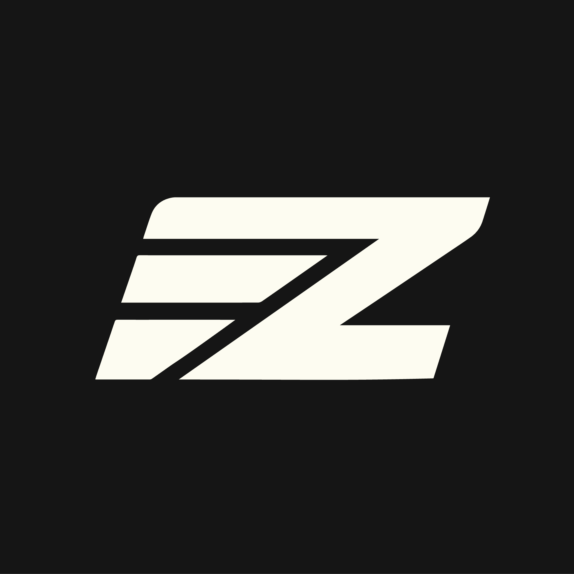
The mark needed to feel as solid as the tool itself.
I explored compact forms and mechanical geometry to create a logo with enough weight to stand out on the product while remaining clear at smaller sizes.
I explored compact forms and mechanical geometry to create a logo with enough weight to stand out on the product while remaining clear at smaller sizes.
I explored compact forms and mechanical geometry to create a recognizable mark.



VISUAL IDENTITY & MOCKUPS
VISUAL IDENTITY & MOCKUPS
TURNING ENGINEERING INTO A VISUAL SYSTEM.
The logo became the foundation for a visual system built across typography, color, and supporting graphic elements.
The logo became the foundation for a visual system built across typography, color, and supporting graphic elements.
Engineering a Visual System.
Typography, color, and assets built with hardware precision.




FROM IDENTITY TO PRODUCT
FROM IDENTITY TO PRODUCT
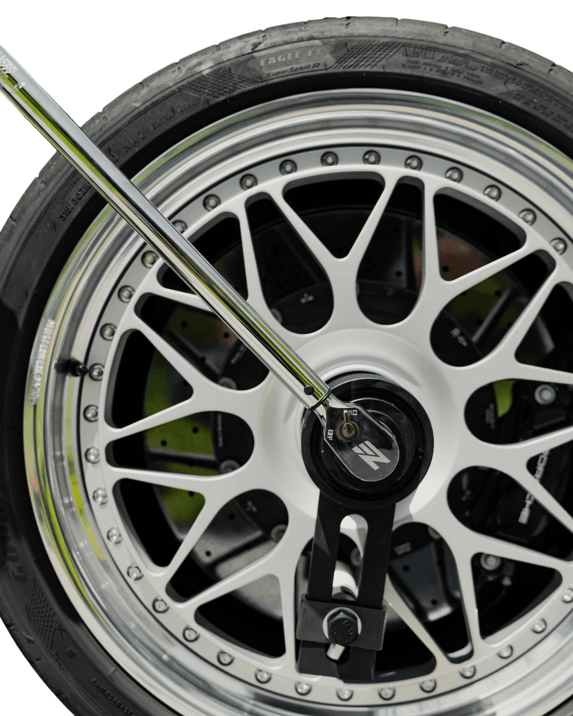
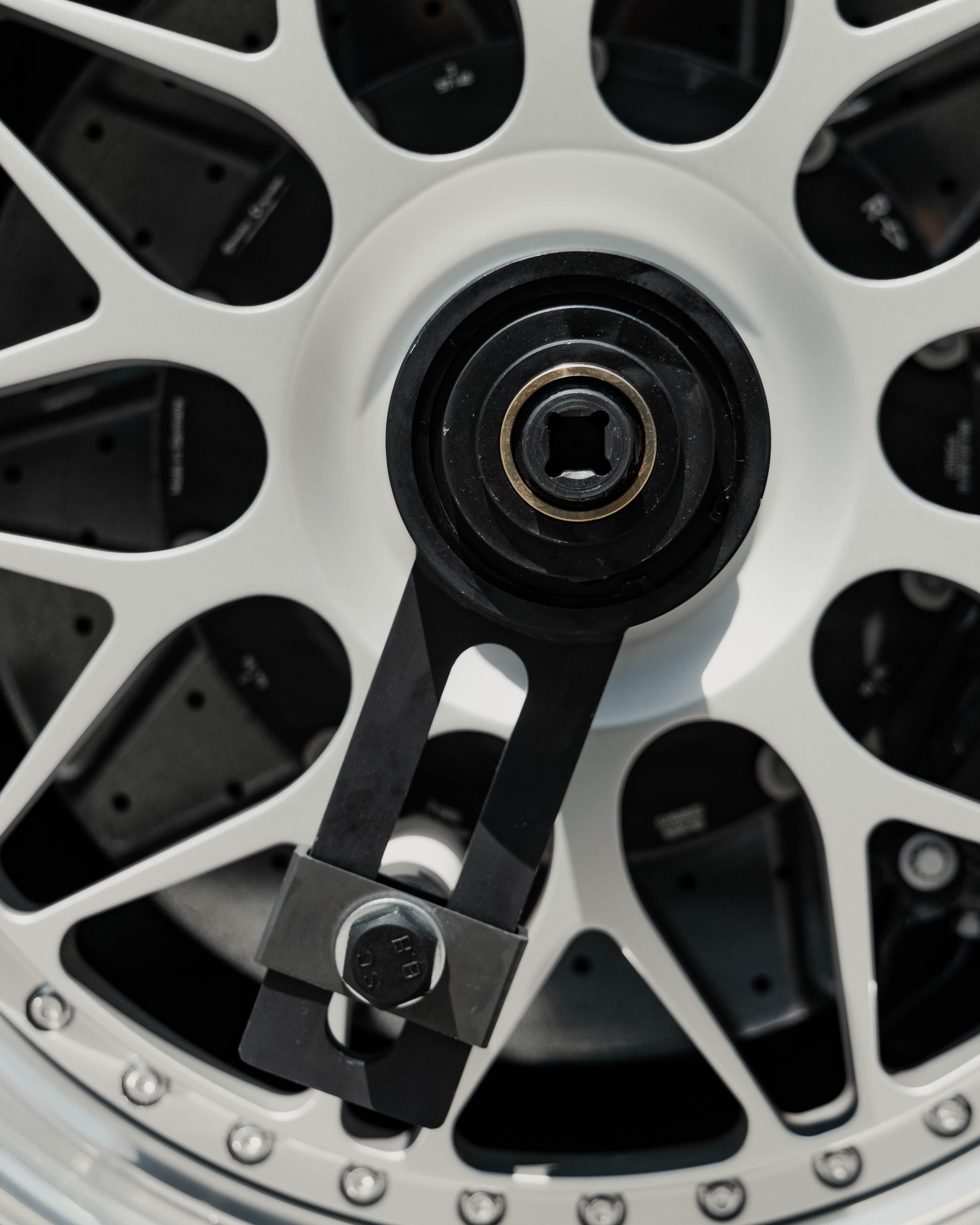
A brand identity proves itself when it leaves the screen.
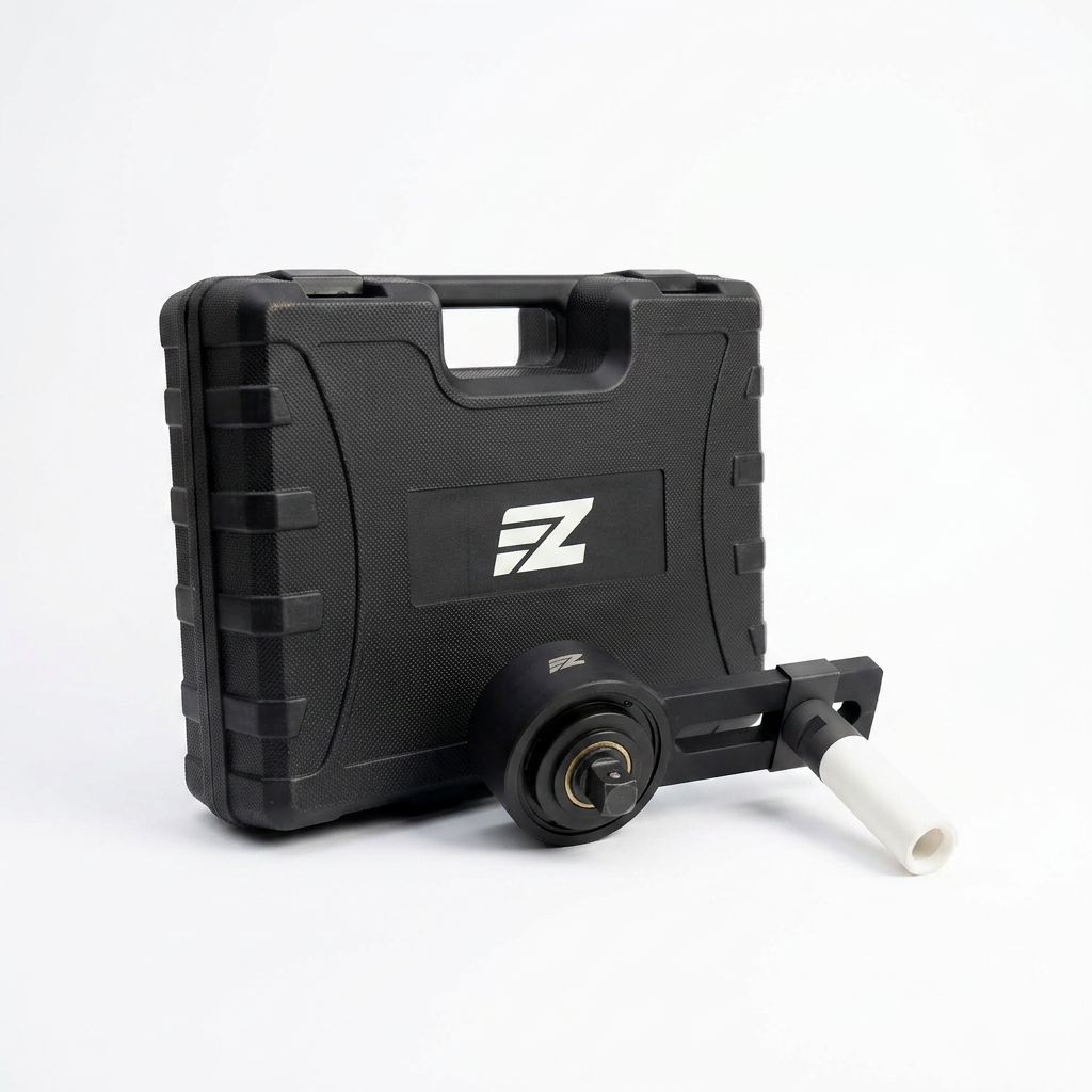
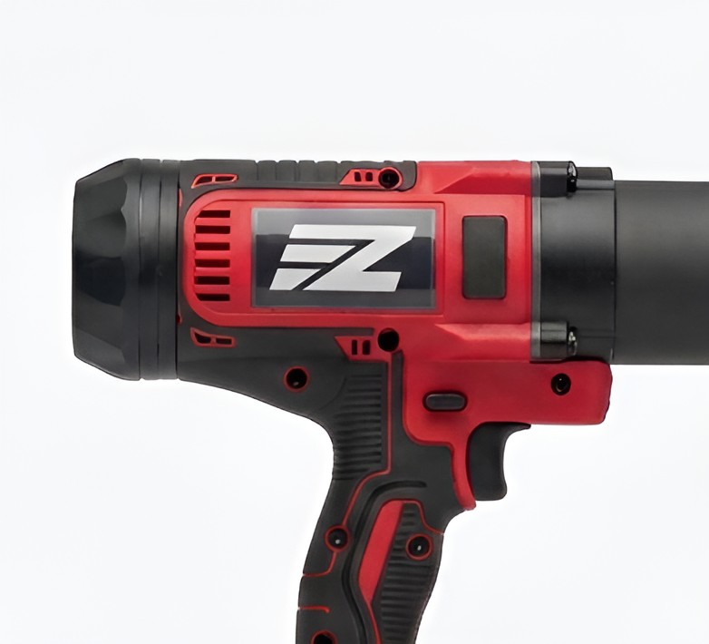
Applied to the EZOFF tool, the identity becomes a physical expression of the precision and performance behind the product.
Applied to the EZOFF tool, the identity becomes a physical expression of the precision and performance behind the product.
Beyond the screen.
On the tool, the identity feels as purposeful as the product itself.





THE RESULT
THE RESULT
A BRAND BUILT TO MATCH THE PRODUCT.
The result is a sharper, more confident identity built around precision, performance, and a premium automotive character.
Built to Match the Product
A sharper, more confident identity for performance and precision.
A BOLD AND CONFIDENT IDENTITY BUILT TO MATCH PRECISION HARDWARE


Selected Work


EZOFF | Built for Performance
Brand identity designed for a precision automotive tool built to make Porsche centerlock wheel removal easier, safer, and more effortless.
Client
Jake | Founder of EZOFF
Role
Brand Design
Date
2026
ABOUT EZOFF
Some jobs demand more than force, they demand the right tool.
EZOFF was created to simplify Porsche centerlock wheel removal with a purpose built torque multiplier engineered for serious automotive applications. The product combines mechanical power, precision, and protection in a tool designed to get the job done without compromising the wheel or surrounding components.
THE CHALLENGE
EZOFF had the hardware, what it needed was a brand that looked like it belonged behind it.
The identity had to communicate strength and engineering without falling into the usual visual language of aggressive automotive brands.
The goal was to create something that felt technical, confident, and premium, while remaining instantly recognizable across the product and every future touchpoint.
LOGO DESIGN
The mark needed to feel as solid as the tool itself.
I explored compact forms, mechanical proportions, and directional geometry to create a logo with enough visual weight to stand out on a physical product, while staying simple enough to remain clear at smaller sizes.
VISUAL IDENTITY & MOCKUPS
The rest of the system was designed to give EZOFF a consistent visual language from typography and color to supporting graphic elements so the brand could feel unmistakably the same whether it appeared on a tool, a website, or a marketing asset.


FROM IDENTITY TO PRODUCT
A brand identity proves itself when it leaves the screen.
Applied directly to the EZOFF tool, the system translates into a physical product that feels considered, purposeful, and unmistakably connected to the performance behind it.
THE RESULT
EZOFF now has an identity built to match what the product represents.
A sharper visual presence, a more confident personality, and a flexible system designed to carry the brand across physical and digital touchpoints without losing the precision that started it all.

HAVE A BRAND THAT NEEDS TO MOVE FORWARD?
HAVE A BRAND THAT NEEDS TO MOVE FORWARD?

Featured Designs
Selected Work